Paw House
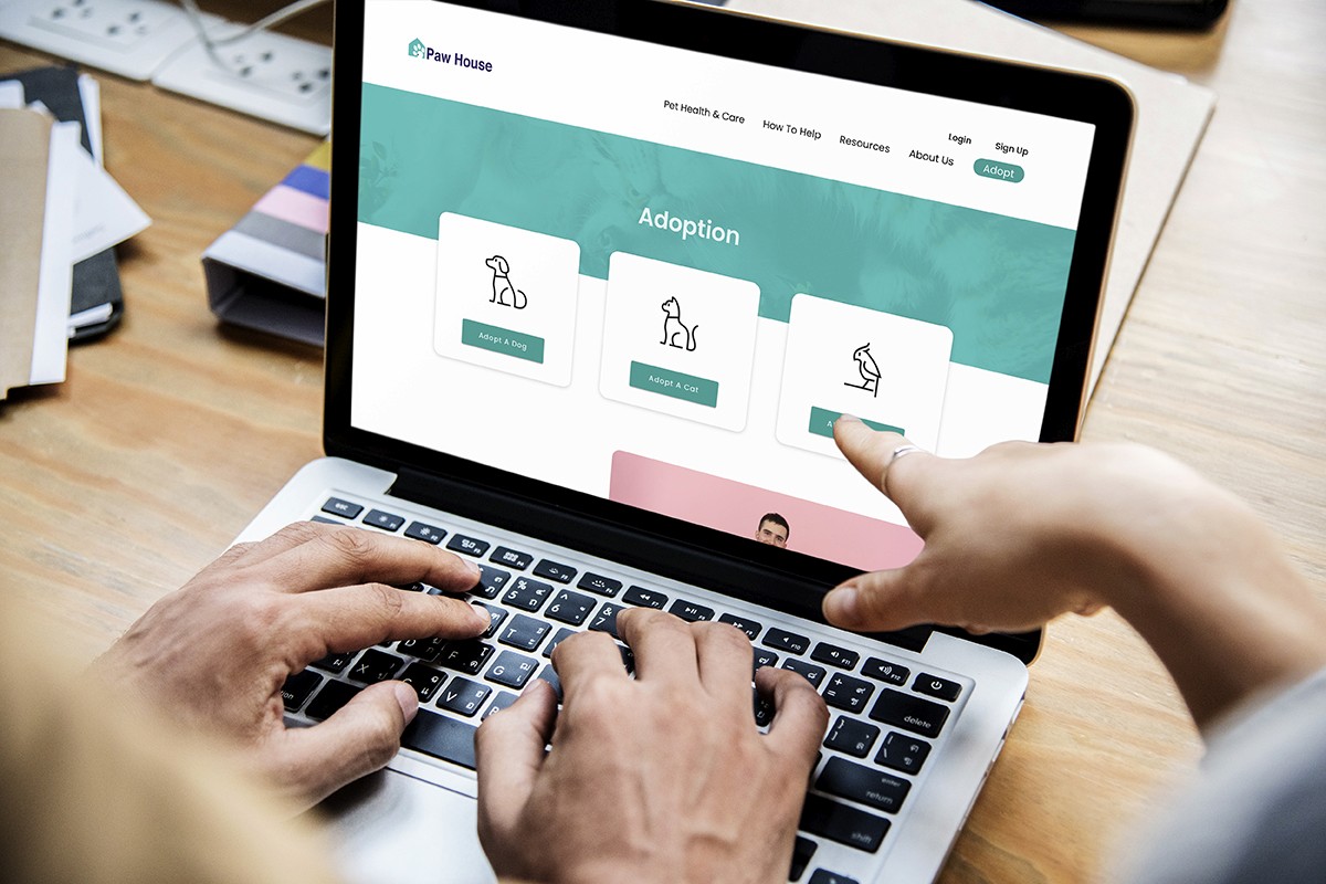
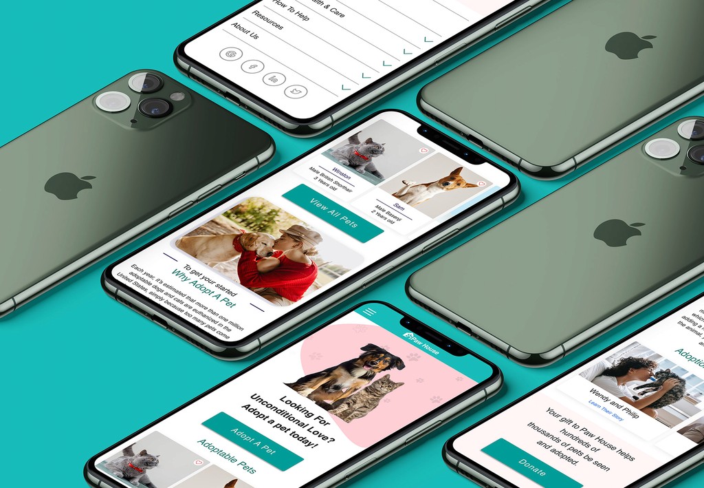
Paw House is a responsive website designed for a local animal shelter to streamline and simplify the pet adoption process. The platform allows users to explore adoptable pets, schedule adoptions online, and complete the entire adoption process virtually, providing a comprehensive, contactless experience.
Role
UX/UI Designer
Project Type
Self Project
Duration
3 Weeks
Identifying the Need
During the pandemic, demand for pet adoption grew as people sought companionship at home. Traditional in-person processes at shelters posed health risks and physical limitations, making it challenging for prospective adopters to engage safely. The need was clear: a digital solution that allows adopters to explore, connect, and complete adoptions with minimal contact while retaining the important aspects of in-person interaction.
Project Goal
The goal was to design a responsive site where users could discover adoptable pets, learn about shelter protocols, and complete the adoption process online. The site also needed to support shelter objectives, such as ensuring that adopters meet essential care criteria for the pets.
Research & Pain Points
User surveys, interviews, and shelter visits offered insights into the user experience and shelter requirements. Key pain points identified included difficulty in accessing consistent adoption information, limited opportunities for remote bonding with pets, and challenges in meeting shelter requirements online. These insights informed the core design principles, aligning the digital adoption process with both user convenience and shelter standards.

Users need to have a way to adopt a pet without going to the shelter

Users need to be able to find and identify the right pet for them online

User needs to prove themself to the shelter that they can take care the pet.
Personas & Empathy Mapping
User personas were crafted to reflect common adopter motivations and needs. An empathy map outlined user perspectives, aligning the design with values such as compassion, convenience, and transparency, ensuring the adoption journey was both user-friendly and attuned to the shelter’s goals.
User Flow & Content Structure
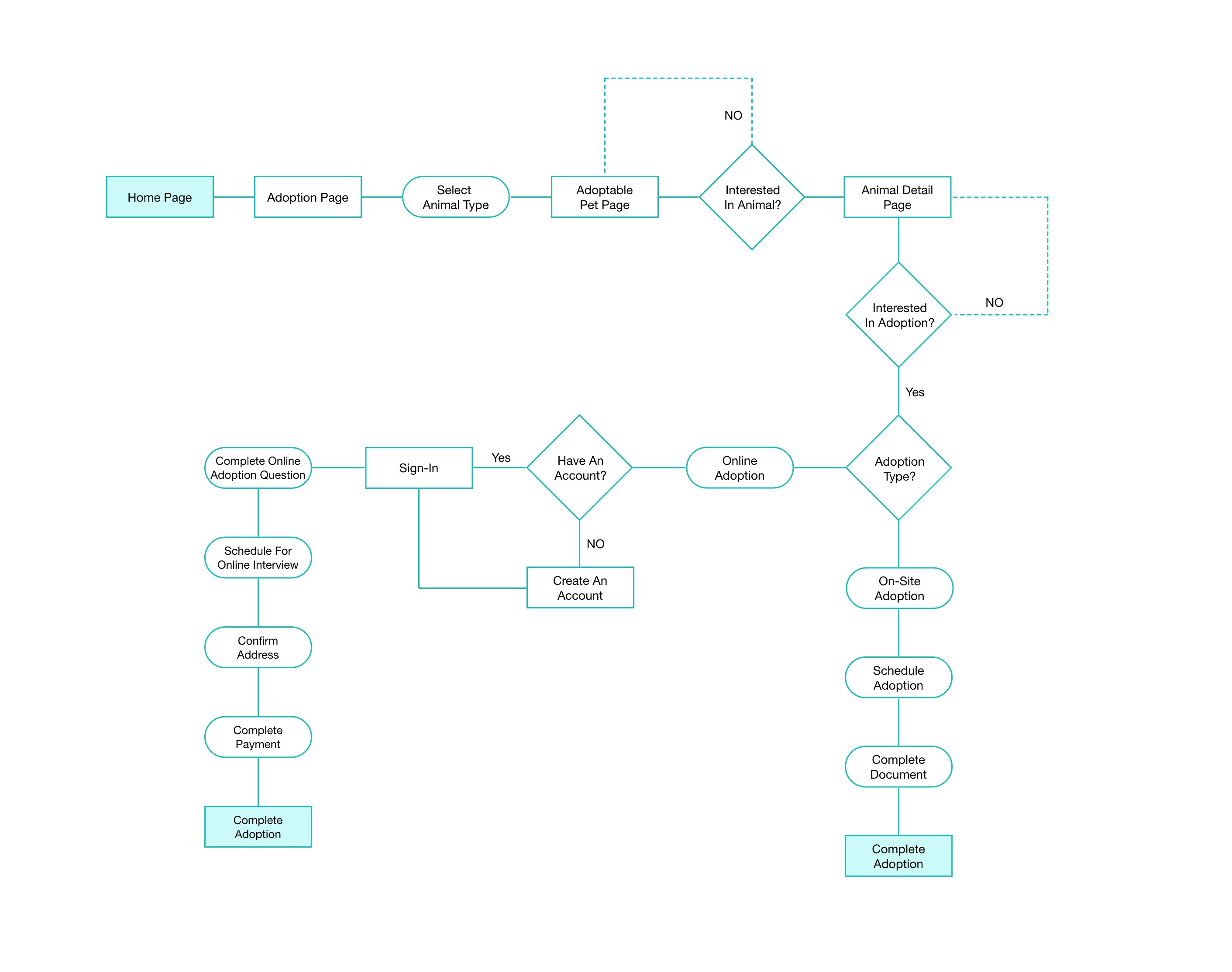
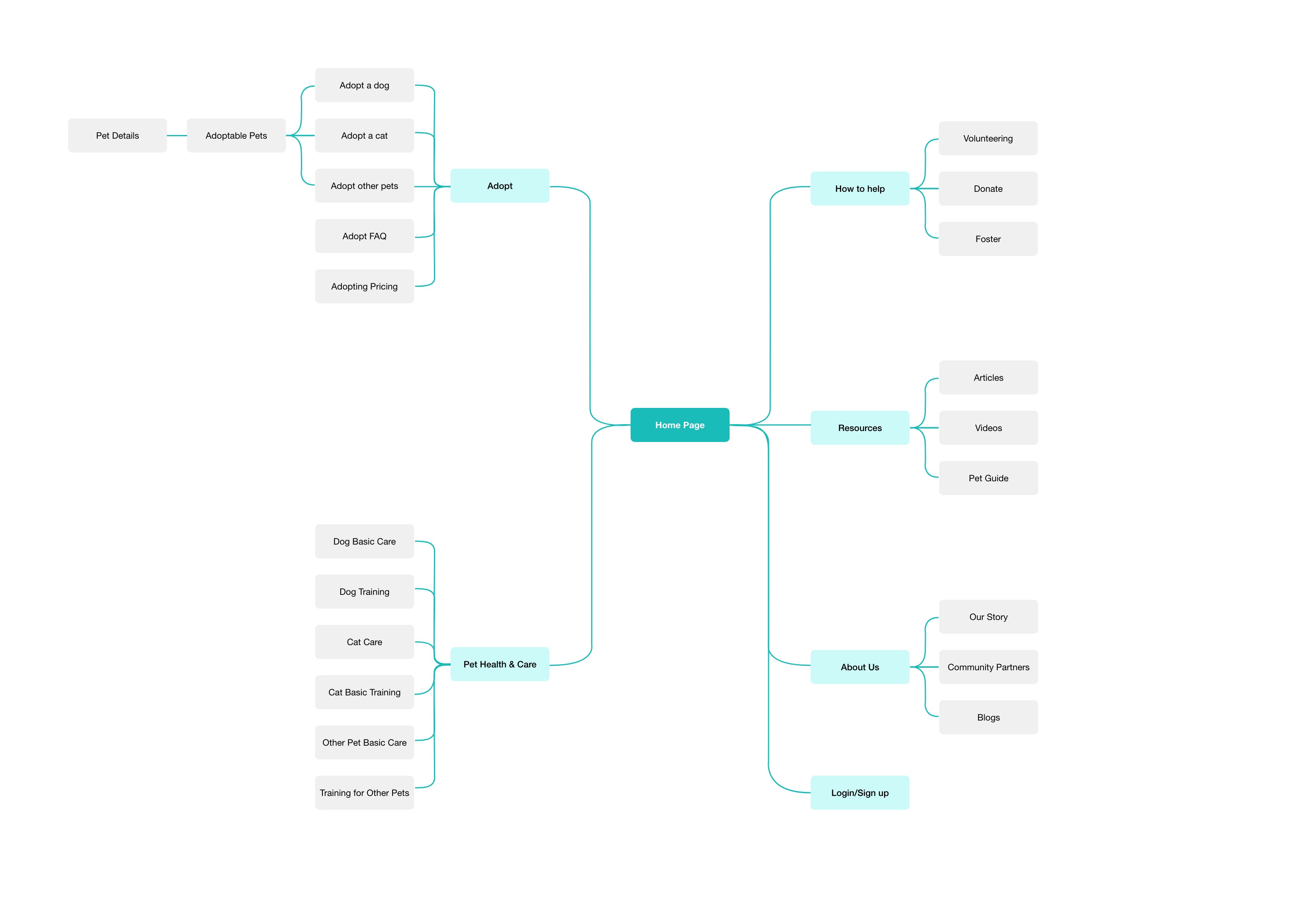
A comprehensive user flow outlined the digital adoption process, from pet discovery to adoption completion. The information architecture was structured to prioritize intuitive navigation, enabling users to browse adoptable pets, schedule meetups, and follow the adoption process seamlessly.
Wireframing & Digital Iteration
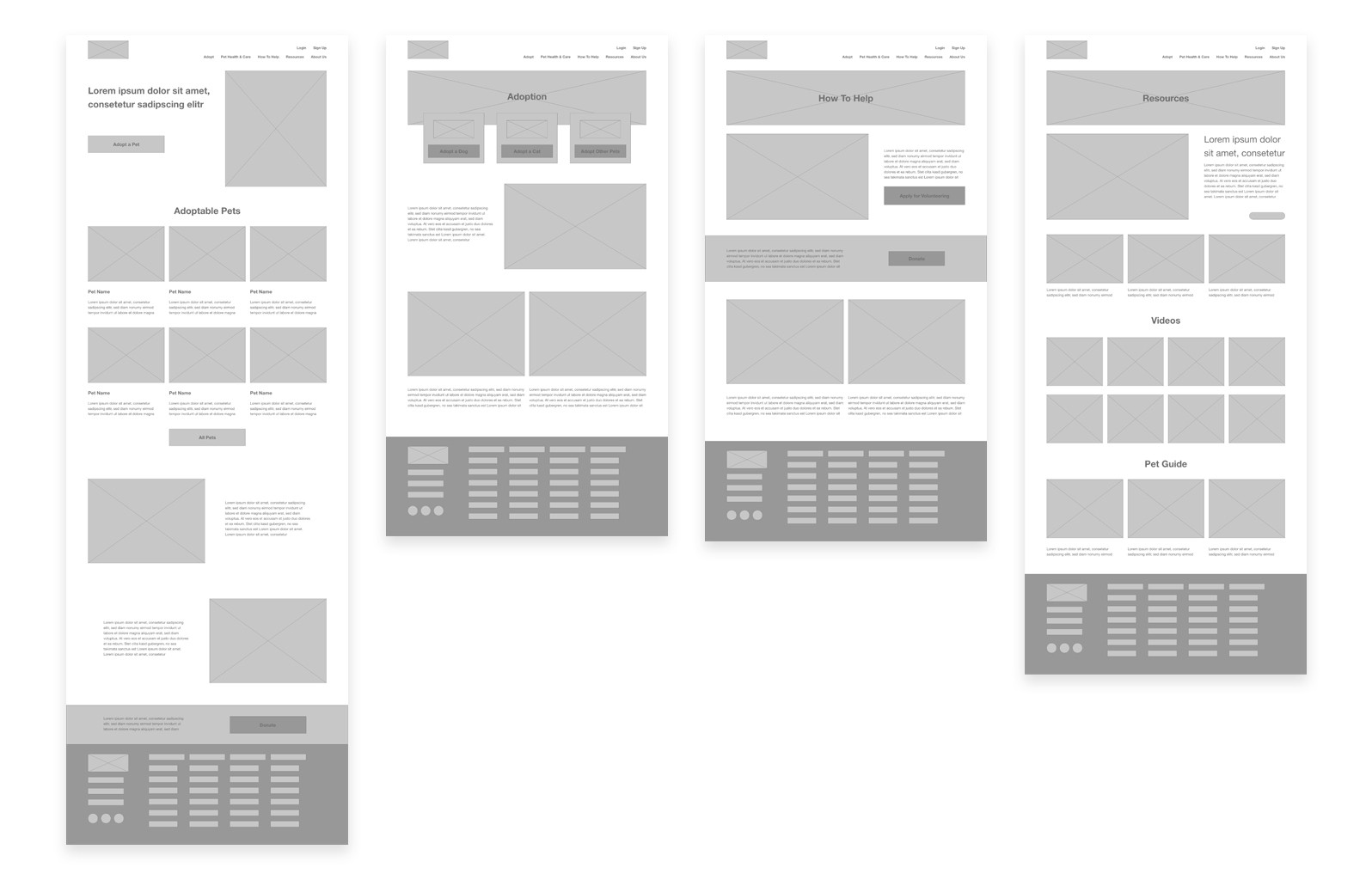
Sketches and paper wireframes set the foundation, followed by multiple iterations of digital wireframes to refine layout and usability. A prototype allowed for early usability testing, identifying areas for improvement to streamline the online adoption flow.
Visual Design & Consistency
A cohesive design system ensured visual and functional consistency. Friendly, clear visuals and a responsive layout enhanced usability, while high-fidelity mockups provided an engaging, polished experience across both desktop and mobile views.
Results & Key Takeaways
Developing Paw House provided valuable insights into designing for both functionality and empathy. The project underscored the importance of creating a cohesive experience across devices, where ease of use and intuitive navigation are essential for user engagement. Through iterative testing and refinement, the project highlighted how digital solutions can meet real-world needs, even with minimal external feedback. This experience strengthened my skills in responsive design, user flow optimization, and creating user-centric solutions.
Future Enhancements
Future iterations would include additional features such as a pet-matching algorithm to help users find suitable companions more effectively. To further enhance accessibility and inclusivity, I would conduct a moderated usability study to identify opportunities for improving the design’s adaptability. This would help ensure the platform remains relevant, engaging, and easy to use for a broader audience.

